Everything you need to represent SuperPay correctly. Logo files, color palette, typography, voice guidelines, and downloadable assets for press, partners, and creators.
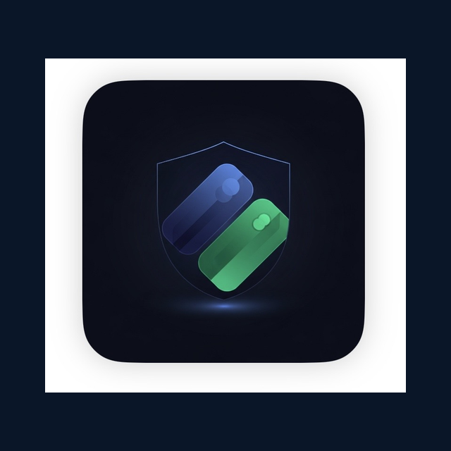
Maintain a minimum clear space equal to the height of the "S" in SuperPay around all sides of the logo. This ensures the mark is always legible and uncluttered.
Minimum sizes
32px — Digital
48px — Preferred
16px — Favicon only
Do
Use the logo at its original proportions with adequate clear space.
Don't
Don't stretch, skew, or distort the logo. Always maintain the original aspect ratio.
Don't
Don't change the logo colors. Use only the approved color variants shown above.
Don't
Don't add drop shadows, glows, outlines, or other effects to the logo.
02 — Color Palette
Colors
Our palette is built around deep navy backgrounds with emerald as the primary accent. Gold and purple serve as secondary accent colors. Click any swatch to copy its hex value.
Primary Colors
Copied!
Navy
#0A1628
rgb(10, 22, 40)
Primary backgrounds, app chrome, and base layer
Copied!
Emerald
#00C896
rgb(0, 200, 150)
Primary CTAs, positive states, brand accent, and links
Accent Colors
Copied!
Gold
#FFB800
rgb(255, 184, 0)
Rewards highlights, Pro tier badges, and warnings
Copied!
Purple
#8B5CF6
rgb(139, 92, 246)
AI features, smart insights, and discovery
Secondary & UI Colors
Copied!
Navy Light
#132240
rgb(19, 34, 64)
Elevated surfaces, cards, and panels
Copied!
Navy Mid
#1A2D4A
rgb(26, 45, 74)
Input fields, secondary surfaces, hover states
Copied!
Muted
#8B9DC3
rgb(139, 157, 195)
Body text, secondary labels, and descriptions
Copied!
Dim
#5A6F94
rgb(90, 111, 148)
Tertiary text, captions, and timestamps
Copied!
Border
#253B5C
rgb(37, 59, 92)
Dividers, card borders, and separators
Copied!
Coral / Danger
#FF6B6B
rgb(255, 107, 107)
Errors, destructive actions, and alerts
Copied!
Emerald Light
#00E5A8
rgb(0, 229, 168)
Hover states for emerald CTAs and gradient endpoints
03 — Typography
Typography
SuperPay uses DM Sans for all UI and marketing text, paired with JetBrains Mono for code, API references, and technical content.
SuperPay speaks with clarity, confidence, and warmth. We're the smart friend who helps you earn more — not a bank, not a finance bro, not a robot.
Smart, not condescending
We explain reward structures clearly without talking down. Our users are intelligent people who happen to not track every rotating category.
"Your Amex Gold earns 4x at restaurants — that's $3.40 back on this dinner. Your Freedom Unlimited would only earn $1.28."
Confident, not arrogant
We're proud of what we build but we don't oversell. No "revolutionary disruption" — just real numbers and real savings.
"SuperPay users typically uncover $1,500–$5,000+ in missed rewards per year. The math does the talking."
Approved missed-rewards stat ranges (use these everywhere):
• Consumers: $1,500–$5,000+/yr in rewards left on the table.
• SMBs / Business: $3,000–$30,000+/yr in rewards left on the table.
Never quote less than $1,500/yr (consumer) or $3,000/yr (business). Never quote a per-month figure that implies a smaller annual number ($30/mo, $40/mo, $200/mo are all out). Per-user, runtime-computed values from a real user's data are fine — these rules apply to fixed marketing copy.
Warm, not corporate
Finance is personal. We write like we're texting a friend a hot tip, not drafting a compliance memo.
"Heads up — Chase just added 5x on streaming this quarter. Your Freedom Flex is about to work way harder."
Precise, not verbose
Every word earns its place. We lead with the number, then the context. No filler, no fluff, no "in order to better serve you."
"$47.20 in cashback this month. You're on track for $142 this quarter."
Writing Do's
Lead with the benefit or number
Use contractions ("you're", "it's")
Be specific: "$3.40 back" not "earn more"
Address the user directly as "you"
Keep sentences under 20 words
Writing Don'ts
Don't use "revolutionize" or "disrupt"
Don't say "we leverage" or "we utilize"
Don't start with "Welcome to SuperPay"
Don't use exclamation marks excessively
Don't use jargon without explaining it
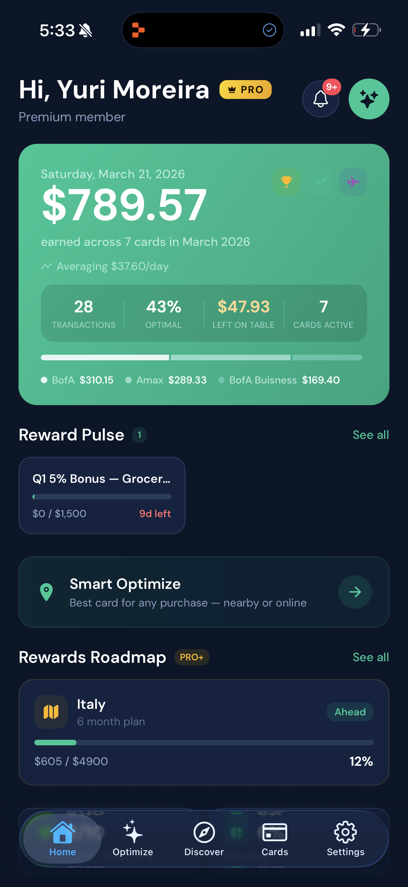
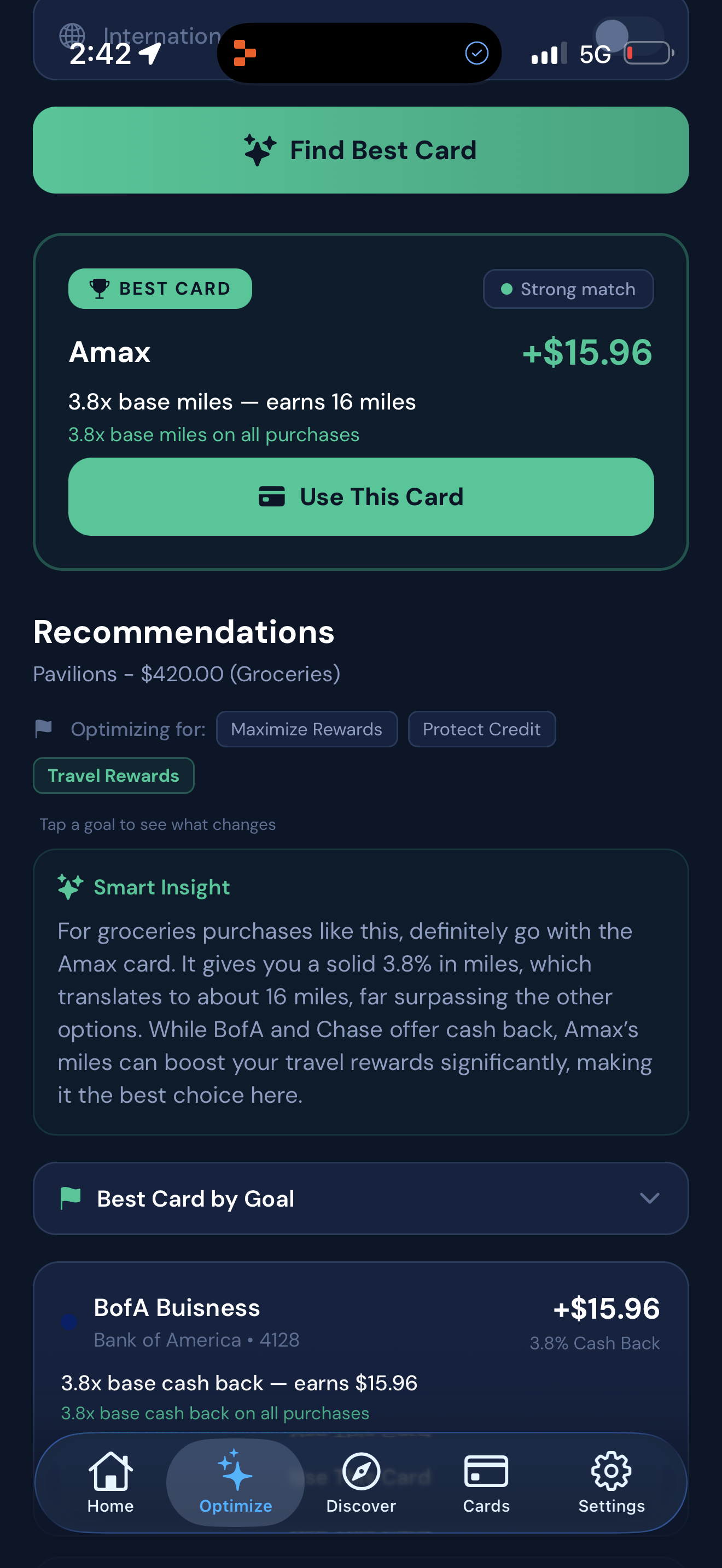
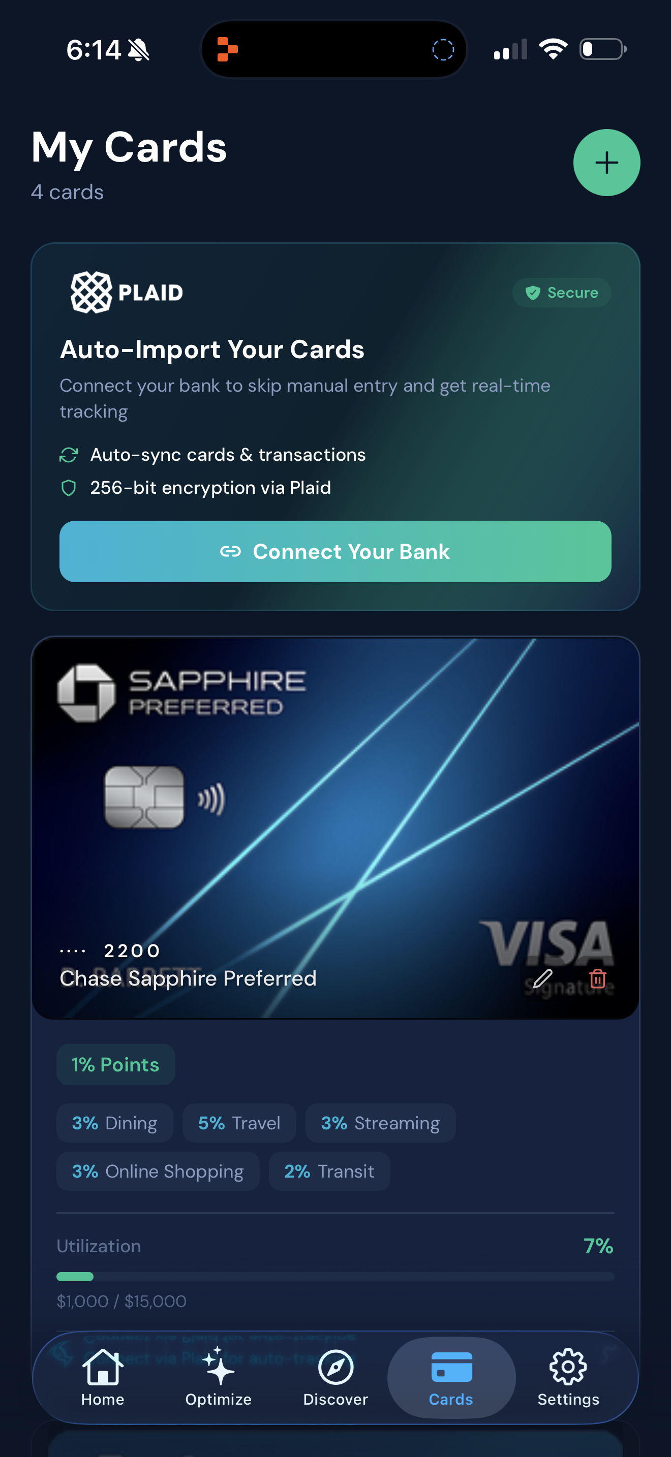
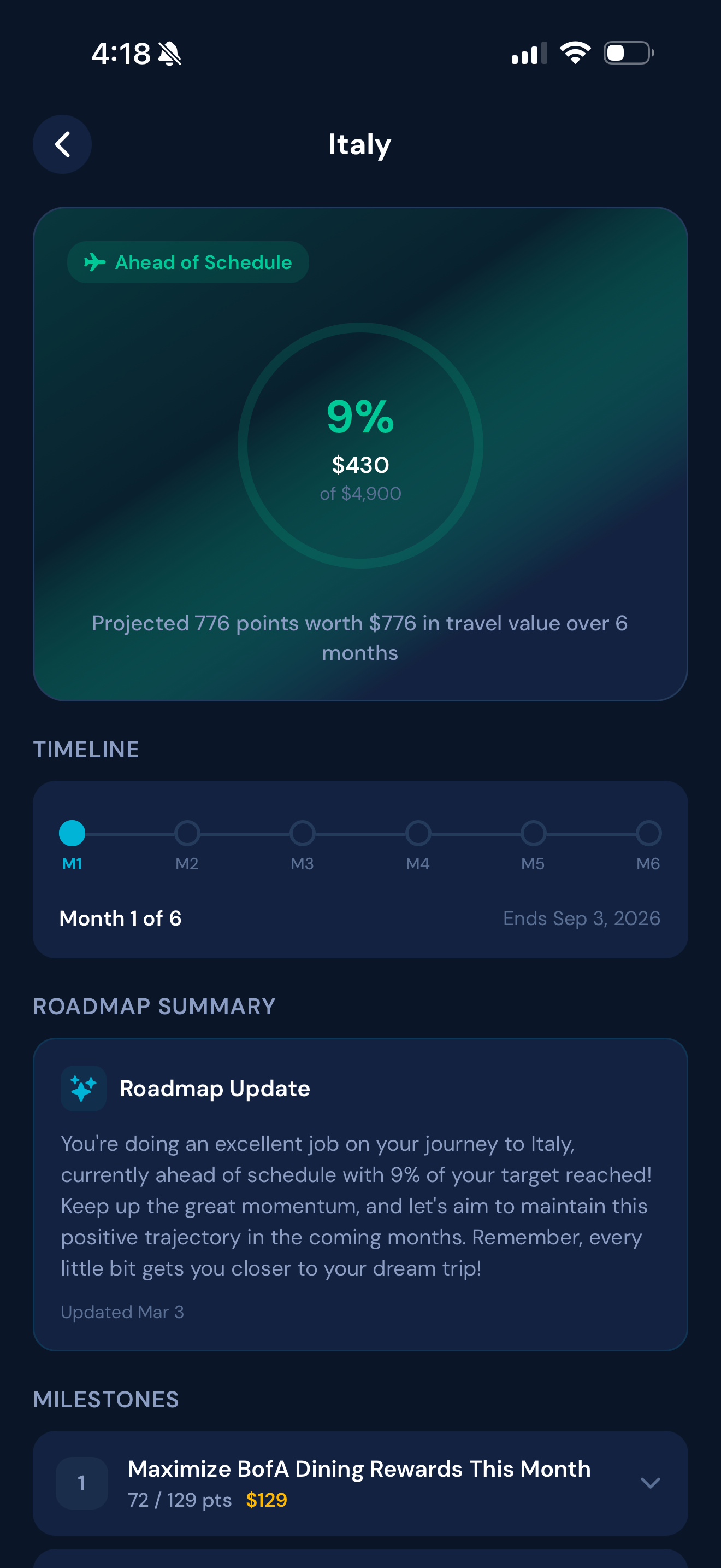
05 — App Screenshots
App Screenshots
High-resolution screenshots of the SuperPay iOS app. Use these for press coverage, blog posts, and partner materials.
How to use SuperPay's brand alongside yours. Co-branding lockups, widget integration on different backgrounds, and social media specs.
Co-Branding
Partner Lockup
Partner
Use a vertical divider to separate the SuperPay shield from your logo. Both marks should be equal visual weight.
Powered By
Powered by
SuperPay
For integrations where SuperPay powers the rewards engine under your brand. Stack vertically for compact layouts.
Widget on Different Backgrounds
Task #735: the widget renders a small card with a SuperPay header (single sign-up CTA) and the top 3 recommended cards as stacked, individually-tappable rows. Light + dark themes shown below. Merchants can additionally opt in to an "Effective cost with SuperPay: $X.XX — after $Y.YY rewards" line rendered into a host-supplied target (typically directly under the Pay button) via data-superpay-effective-cost-target — see the Merchant Partner Guide for gating rules.
Light Theme
Top 3 cards for this purchaseGet the app →
1Blue Cash Preferred6% · $5.24
2Amex Gold4% · $3.50
3Citi Custom Cash5% · $4.37
Dark Theme
Top 3 cards for this purchaseGet the app →
1Blue Cash Preferred6% · $5.24
2Amex Gold4% · $3.50
3Citi Custom Cash5% · $4.37
Social Media Specs
Profile Picture
400 × 400px
Use the shield mark centered on navy background
Cover / Banner
1500 × 500px
Shield + wordmark left-aligned on navy with subtle emerald gradient
OG / Share Image
1200 × 675px
Used for link previews on X, LinkedIn, iMessage, etc.
Need something else?
For press inquiries, custom brand assets, partnership materials, or anything not covered here, reach out to us directly.
 Logo
Logo